Handling finances online especially designed for all Genders 50+
The digital world became an essential part in everyday life but not everyone finds it easy to navigate in it.
Finance is a sensitive topic in both worlds: Online and offline.
I believe that the right accessibility and inclusivity would enable certain users to expand handling their finances, that are usually not very familiar with online services.
Finance is a sensitive topic in both worlds: Online and offline.
I believe that the right accessibility and inclusivity would enable certain users to expand handling their finances, that are usually not very familiar with online services.
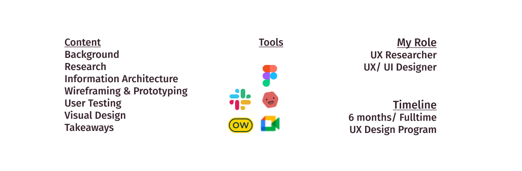
Background
The project acted as an assignment for my UX certified course with an objective to create a finance application. While I was given the project´s business requirements as a starting point,
I had considerable flexibility to modify the concept. The goal was to design a secure bank application with special accessibility for an inclusive experience especially designed for all Genders 50+.
I had considerable flexibility to modify the concept. The goal was to design a secure bank application with special accessibility for an inclusive experience especially designed for all Genders 50+.
Let me walk you through the project or download Case Study.
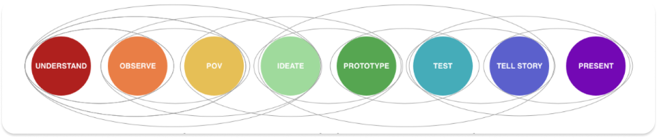
The Design Thinking Process adapted from Paris-Est d. school at Ecole des Ponts guided me through the process of designing the Responsive Web Application.
Understand & Observe
Competitive Analysis | User Interviews | Online Surveys
Identifying needs, motivations, and challenges is an eminent part of UX Design.
Through user research I am able to develop the right product for the user group.
Through user research I am able to develop the right product for the user group.
After having identified and analyzed three competitors I gained valuable insights how certain companies achieve a positive user experience. However, specifically addressing user group 50+ who ist not necessarily familiar handeling finances online was missing.
You can check the Analysis here.
You can check the Analysis here.
Then I defined my research goals.
Based on these goals, I have conducted
an online survey for quantative feedback,
and interviews for qualitative feedback.
Based on these goals, I have conducted
an online survey for quantative feedback,
and interviews for qualitative feedback.
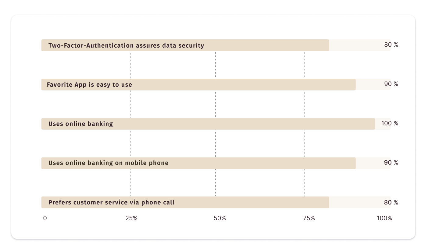
Survey
Since I was interested in getting a general idea, this survey wasn´t solely aligned for the user group age 50+.
Since I was interested in getting a general idea, this survey wasn´t solely aligned for the user group age 50+.
The reason was:
- Getting a first impression what user like about their favorite website or app
- Getting a feeling of the overall importance of security standards
- Getting an idea of what type of customer service is preferred
- Getting a first impression what user like about their favorite website or app
- Getting a feeling of the overall importance of security standards
- Getting an idea of what type of customer service is preferred
User Interviews
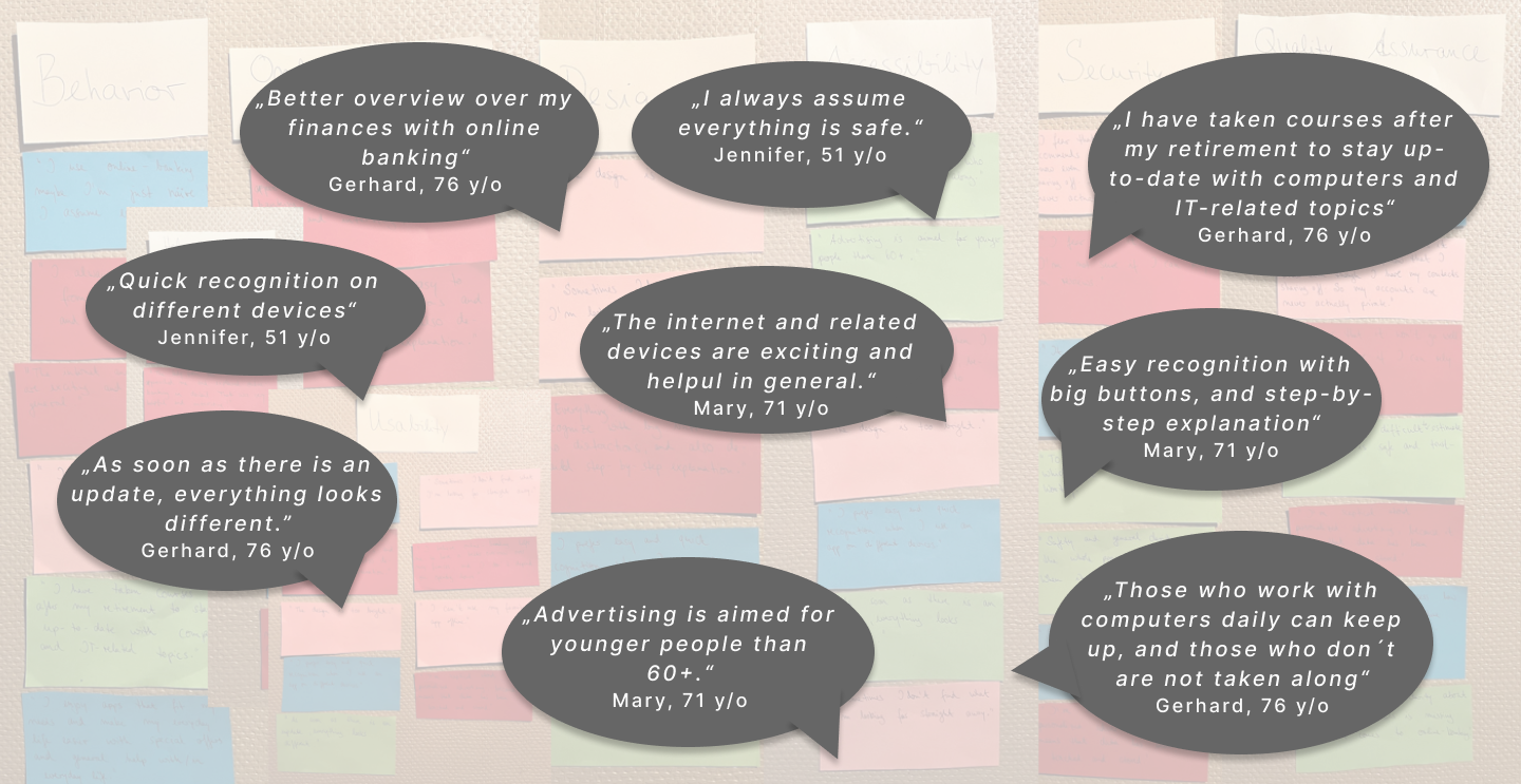
The emphasis laid on user interviews to gather qualitative feedback from participants of the agegroup 50+. An important step in the research process because I had the chance to talk to potential users in person to dive deep into their expectations, and identify painpoints.
The emphasis laid on user interviews to gather qualitative feedback from participants of the agegroup 50+. An important step in the research process because I had the chance to talk to potential users in person to dive deep into their expectations, and identify painpoints.
The goal was:
- Identifying obstacles/ reasons why users feel uncomfortable using online banking
- Finding solutions to help them feel more comfortable handling finances online
- Identifying digital products or services that work for users 50+
- Identifying obstacles/ reasons why users feel uncomfortable using online banking
- Finding solutions to help them feel more comfortable handling finances online
- Identifying digital products or services that work for users 50+
The interviews went smoothly although first all particpants individually questioned how they could actually help me. It was very informative and I was suprised that none of them had a general rejection of technology: They all enjoyed using mobile phones, computers and tablets and incorporated them into their everyday life.
To analyze the collected data, I have used the method of Affinity Mapping, which helped me isolating
various information, and discovering patterns within the data.
various information, and discovering patterns within the data.
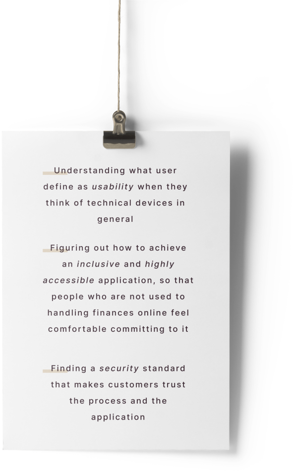
Findings & Insights
Users of the target group feel left out when it comes to the internet and related devices.
In general, they see the benefits of online services, as well as online banking.
They all mostly enjoy using digital products and online services that help them expanding their knowledge and that serve creativity purposes.
They see a lack of in-depth explanation, clarity and guidance when it comes to online-banking and internet devices in general.
Easy recognition is important for users of the target group.
The participants feel left alone because everyone expects knowing oneself around online and with technical devices.
The participants value in-person customer service.
They prefer clear and simple instructions.
All of the participants question the security aspect of online banking.
I believe here lays the opportunity:
Enabling participation of a big and important age group through accessibility and inclusivity.
Point of View & Ideate
User Personas | User Journey | Sitemap
Through my research I have gained valuable insights about users who want to be able to handle
finances online easy, safe, and without having in-depth IT-knowledge.
With the help of Maya and Gerard we will be able to develop an app that meets their needs, goals and
expectations, and therefore our customers.
finances online easy, safe, and without having in-depth IT-knowledge.
With the help of Maya and Gerard we will be able to develop an app that meets their needs, goals and
expectations, and therefore our customers.


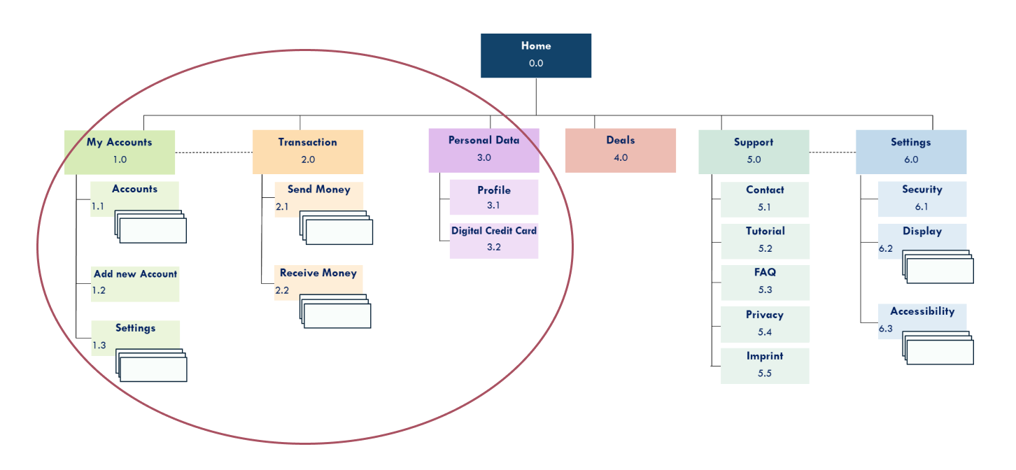
Information Architecture
After having established users´needs, goals, and frustrations, I started organizing and labeling information, making the underlying data structure findable and understandable for the user:
After having established users´needs, goals, and frustrations, I started organizing and labeling information, making the underlying data structure findable and understandable for the user:
It was time to build a sitemap.
Open Card Sorting
I used the participatory method of card sorting to have my sitemap evaluated. That way I was able to estimate the user-friendliness of the existing structure with the help of participants.
The session was conducted online with a tool called OptimalSort. Participants were virtually given 17 cards based on the previous sitemap. They were asked to sort those and then give each group a category name in the next step according to their own logic.
You can check the full report here.
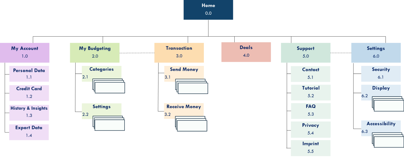
Sitemap - Updated Version
Prototype & Test
User Flows | Wireframes | Prototype | Usability Tests | Visual Design
Before diving into the application´s look and feel,
I started visualizing the essential elements and features, that then were tested by the focus group.
Ringing in the product design process.
I started visualizing the essential elements and features, that then were tested by the focus group.
Ringing in the product design process.
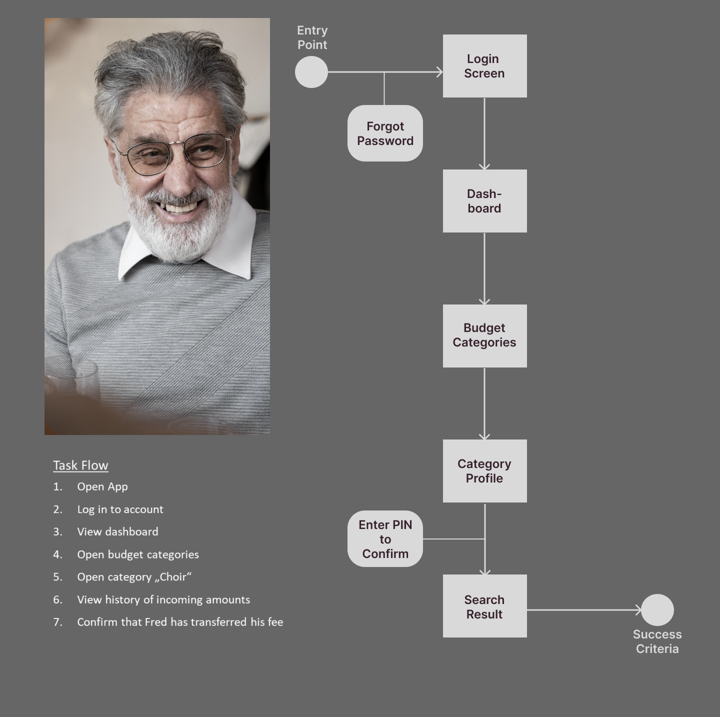
User Flows
The user flows helped me describe the happy paths of the personas. Illustrated in a flowchart.
I mapped out every step an user as to take to accomplish a certain task.
Exemplary: Gerard wants to transfer money to the bus company.
The user flows helped me describe the happy paths of the personas. Illustrated in a flowchart.
I mapped out every step an user as to take to accomplish a certain task.
Exemplary: Gerard wants to transfer money to the bus company.
Those flowcharts were then visually translated into wireframes.
Wireframes
In the next part of the design process, I sketched out low-fidelity wireframes.
Those paper wireframes were used to roughly organize the screen and space, followed by the
mid-fidelity version to test the app´s functionality with users.
In the next part of the design process, I sketched out low-fidelity wireframes.
Those paper wireframes were used to roughly organize the screen and space, followed by the
mid-fidelity version to test the app´s functionality with users.
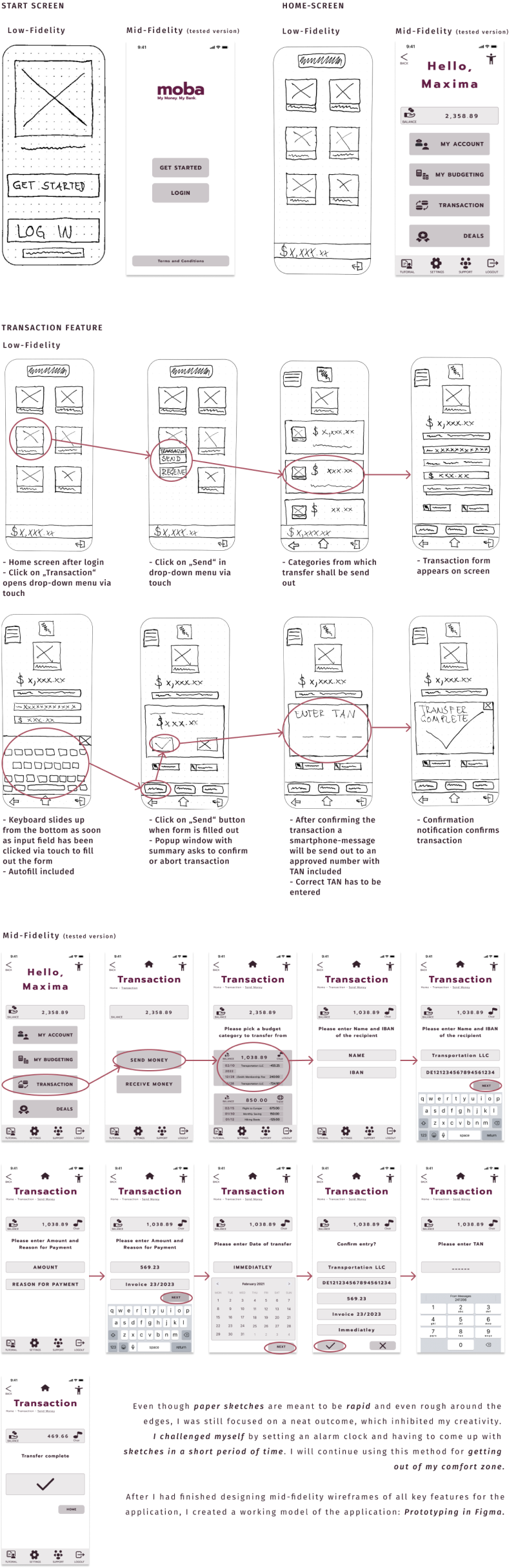
The previous phases helped shaping the application and its functionality -
in theory it worked like a charm.
Let´s uncover errors and opportunities, making sure the functionality meets users´needs.
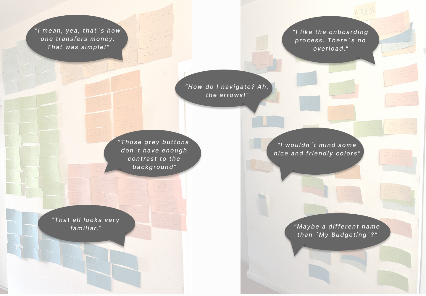
Usability Tests
In this part of the project, I conducted usability tests: This method enabled me to evaluate the convenience and usability of my prototype.
Observing the participants and their interaction with the application identified errors, as well as successful implementations.
In this part of the project, I conducted usability tests: This method enabled me to evaluate the convenience and usability of my prototype.
Observing the participants and their interaction with the application identified errors, as well as successful implementations.
The goal was to develop an application for all genders of age 50+ who are not necessarily used to online banking or online shopping, therefore designed in a way that is inclusive, highly accessible and secure. The application aims to meet people´s Goals and Needs, and wants to address their Frustrations. People like the personas Maya and Gerard. Therefore, it was important to include the age group 50+ into the moderated tests, as well as participants who were dissimilar to it for avoiding sampling bias.
The test plan, test script as well as links to the prototype are linked as followed:
Participants
Margret
Age range: 55 - 64
Identifies as female
Occupation: Dipl. Economist
Online Banking: Never on her mobile phone, regulary via desktop
In general very talkative and took the test very seriously
Age range: 55 - 64
Identifies as female
Occupation: Dipl. Economist
Online Banking: Never on her mobile phone, regulary via desktop
In general very talkative and took the test very seriously
Jen
Age range: 25 - 34
Identifies as female
Occupation: Student, works in tech on the side
Online Banking: Regulary and only via mobile phone
Apologized a lot whenever she was hesitating or couldn´t find the next step
Age range: 25 - 34
Identifies as female
Occupation: Student, works in tech on the side
Online Banking: Regulary and only via mobile phone
Apologized a lot whenever she was hesitating or couldn´t find the next step
Ingrid
Age range: 55 - 64
Identifies as female
Occupation: Lawyer, retired
Online Banking: Never via mobile phone, regulary via desktop
Was overall in a very cheerful mood
Age range: 55 - 64
Identifies as female
Occupation: Lawyer, retired
Online Banking: Never via mobile phone, regulary via desktop
Was overall in a very cheerful mood
Stefan
Age range: 55 - 64
Identifies as female
Occupation: Dipl. Economist
Online Banking: Never on her mobile phone, regulary via desktop
Laughed a lot and was very relaxed
Age range: 55 - 64
Identifies as female
Occupation: Dipl. Economist
Online Banking: Never on her mobile phone, regulary via desktop
Laughed a lot and was very relaxed
Silvia
Age range: 55 - 64
Identifies as female
Occupation: Self-employed, Consultant
Online Banking: Never via mobile phone, regulary via desktop
Was very firm throughout the test
Age range: 55 - 64
Identifies as female
Occupation: Self-employed, Consultant
Online Banking: Never via mobile phone, regulary via desktop
Was very firm throughout the test
Tim
Age range: 35 - 44
Identifies as male
Occupation: Mechanical Engineer
Online Banking: Regulary via mobile phone, sometimes via desktop
Seemed to be in a rush when he arrived but took his time for the test
Age range: 35 - 44
Identifies as male
Occupation: Mechanical Engineer
Online Banking: Regulary via mobile phone, sometimes via desktop
Seemed to be in a rush when he arrived but took his time for the test
The participants were able to complete all tasks asked of them, however,
guidance was necessary. All participants pointed out, that they liked the minimalistic and simple approach of the application but stumbled across the naming of certain features.
Affinity Mapping was the methodology of choice to organize the collected data
and analyze feedback given by the participants, isolate bits of information,
and helped me identifying patterns.
The next step was to digitalize my findings and generate visual patterns in a spreadsheet via Rainbow Analysis. Observations were transferred into the spreadsheet. Each participant had been assigned a color, and whenever a participants had made one of the observations, the assigned color was filled into the appropriate box: The more colors per observation, the higher level of severity due to frequency. In addition, Jakob Nielsen´s Rating Scale was used to rate the identified usability Problems.
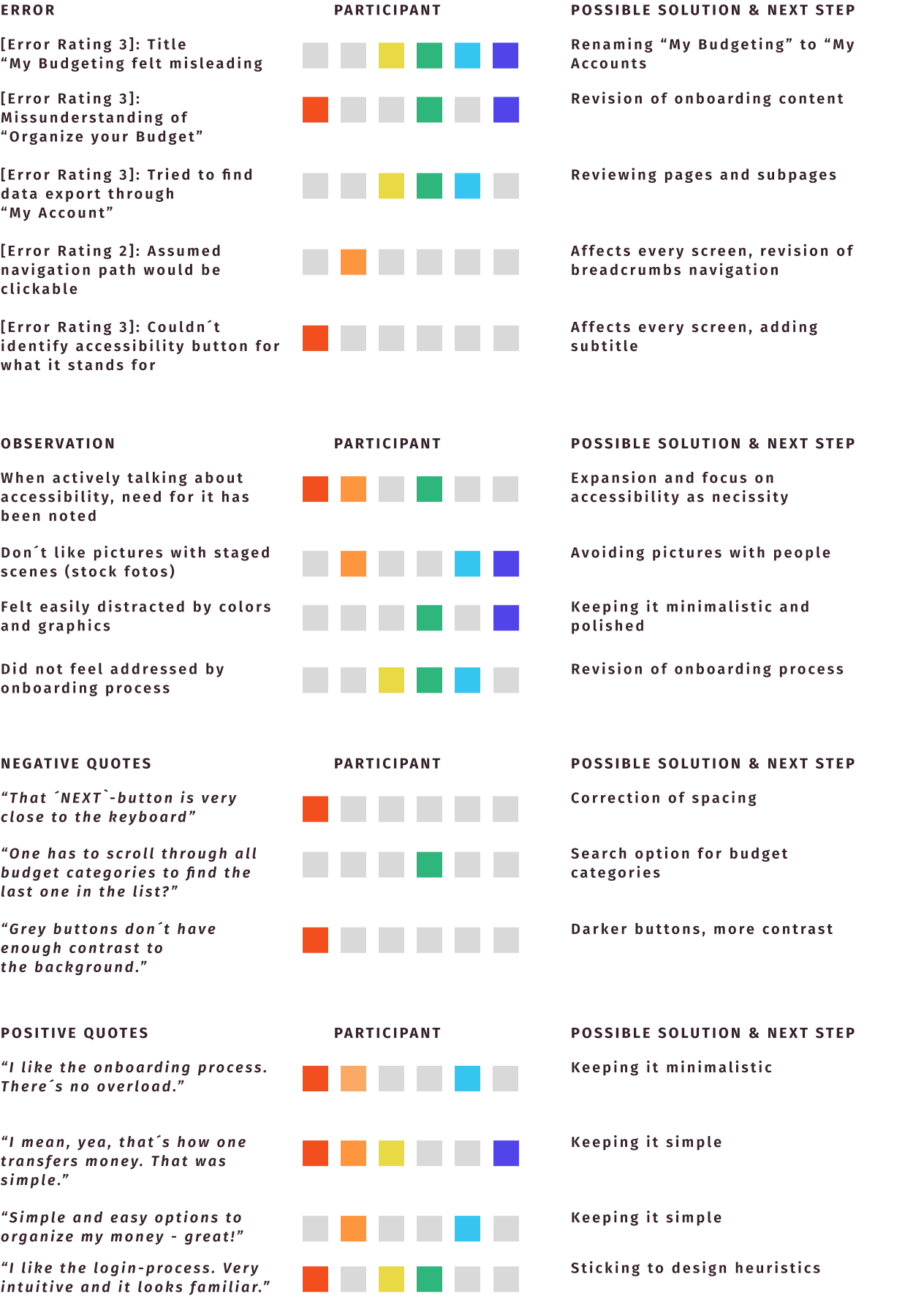
Based on the feedback that I have received during the user interviews, I adjusted the sitemap once again which included renaming certain features.
You can check the full report here:
Usability Test Report
Usability Test Report
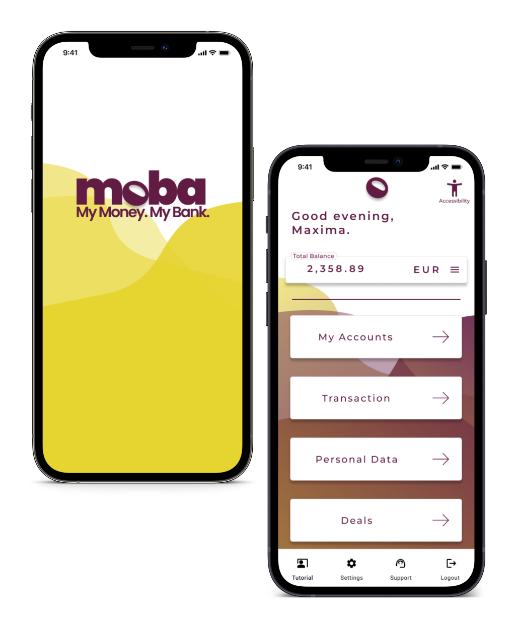
Visual Design
I wanted to develop an application that addresses people of the age group 50+ that are not necessarily familiar with handling finances online. In this phase the user interface has been created.
It was finally time to refine the design.
I wanted to develop an application that addresses people of the age group 50+ that are not necessarily familiar with handling finances online. In this phase the user interface has been created.
It was finally time to refine the design.
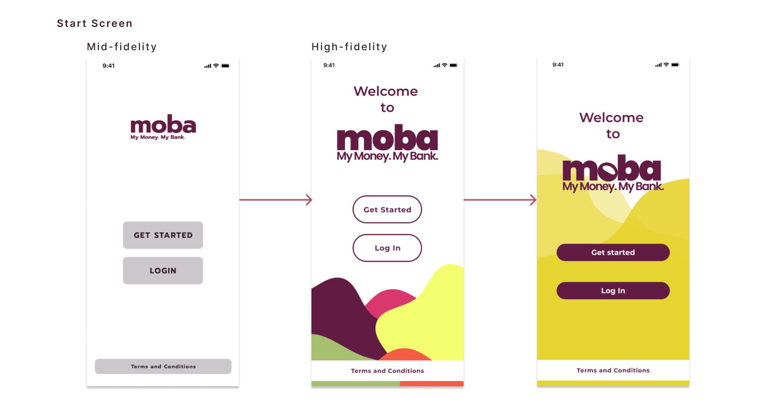
I knew early on that I wanted to support the logo color with bright colors and organic shapes throughout the application. The color palette was then reduced to the complimentary colors, and a more calm organic shape was added to the background.
I have learned that simplicity shouldn´t equal total absence of color. Playing around with colors and shapes helped narrowing down ideas, and having the design reviewed by fellow designers played an important part.
I have learned that simplicity shouldn´t equal total absence of color. Playing around with colors and shapes helped narrowing down ideas, and having the design reviewed by fellow designers played an important part.
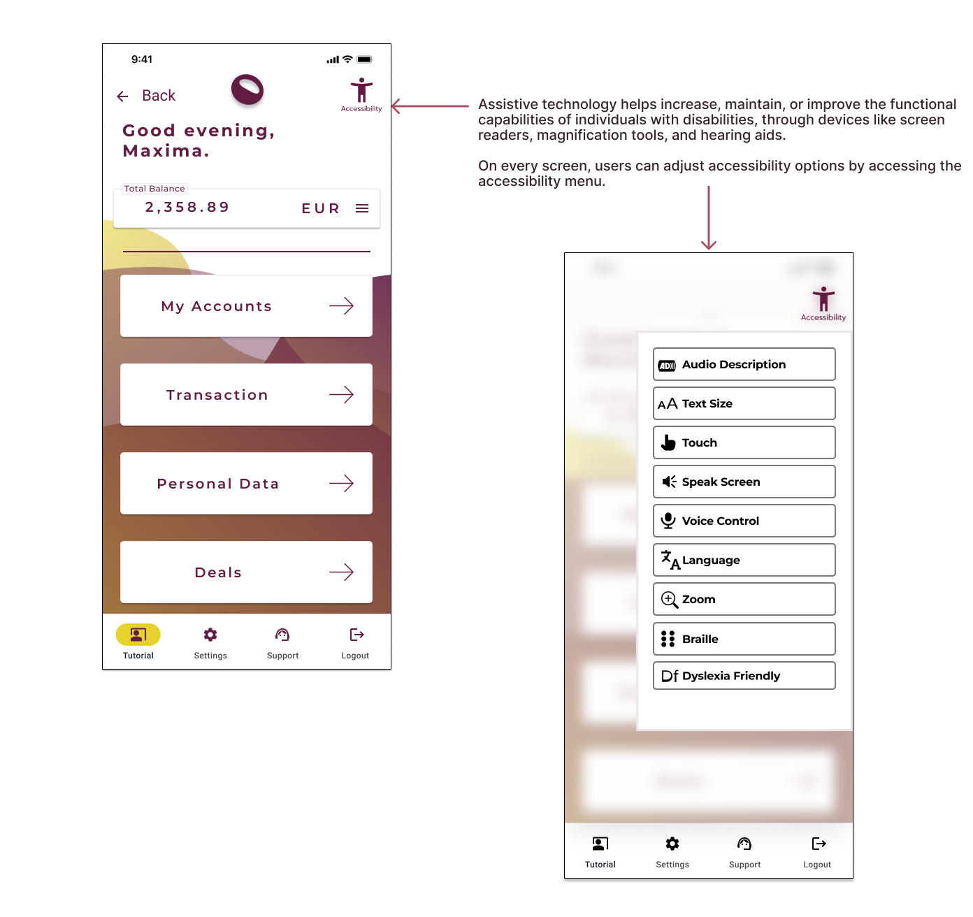
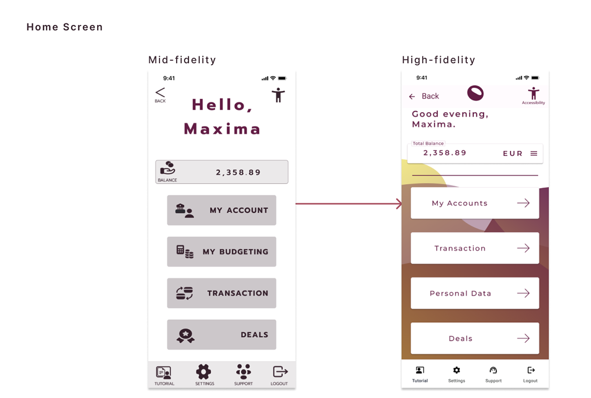
The goal has always been to keep the design minimalistic yet informative enough for the user group 50+ that is not necessarily used to handling finances online. There has also been an emphasis on accessibility which explains the big buttons and cards. Usability testing has supported those decisions. To reduce cognitive overload, icons were eliminated. I have then intensified the shadows for a more distinct appearance compared to the background.
I have learned that there are uncountable ways to design a screen, even if it comes to a limited space like a mobile phone. It is important to focus on functionality, and always keeping the focus group in mind. At the end, the product will be shaped through usability testing.
I have learned that there are uncountable ways to design a screen, even if it comes to a limited space like a mobile phone. It is important to focus on functionality, and always keeping the focus group in mind. At the end, the product will be shaped through usability testing.
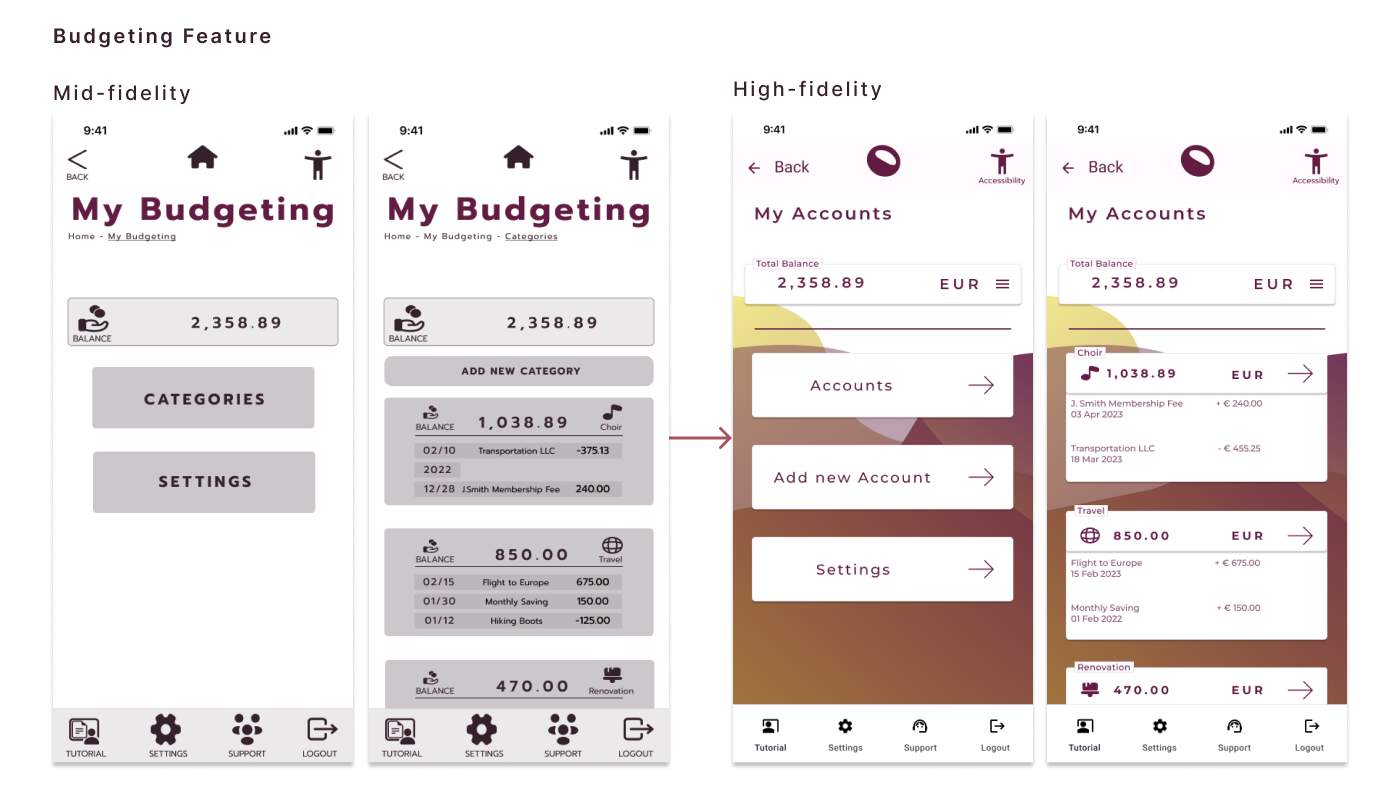
The app provides the option to organize ones budget in different subaccounts. Usability tests had shown that the original naming led to confusion. I have used these results to rename it and also adjust the menu structure and functionality of the subpages.
I have learned that usability testing should only be limited by a dead line. There are many ways to get a quick feedback from users and from fellow designers, and it is also essential for being reminded of and seeing the bigger picture of the product.
I have learned that usability testing should only be limited by a dead line. There are many ways to get a quick feedback from users and from fellow designers, and it is also essential for being reminded of and seeing the bigger picture of the product.
After another round of additional peer feedback on the User Interface Design, I have polished the UI.
You can check the Design Documentation and Language here.
You can check the Design Documentation and Language here.
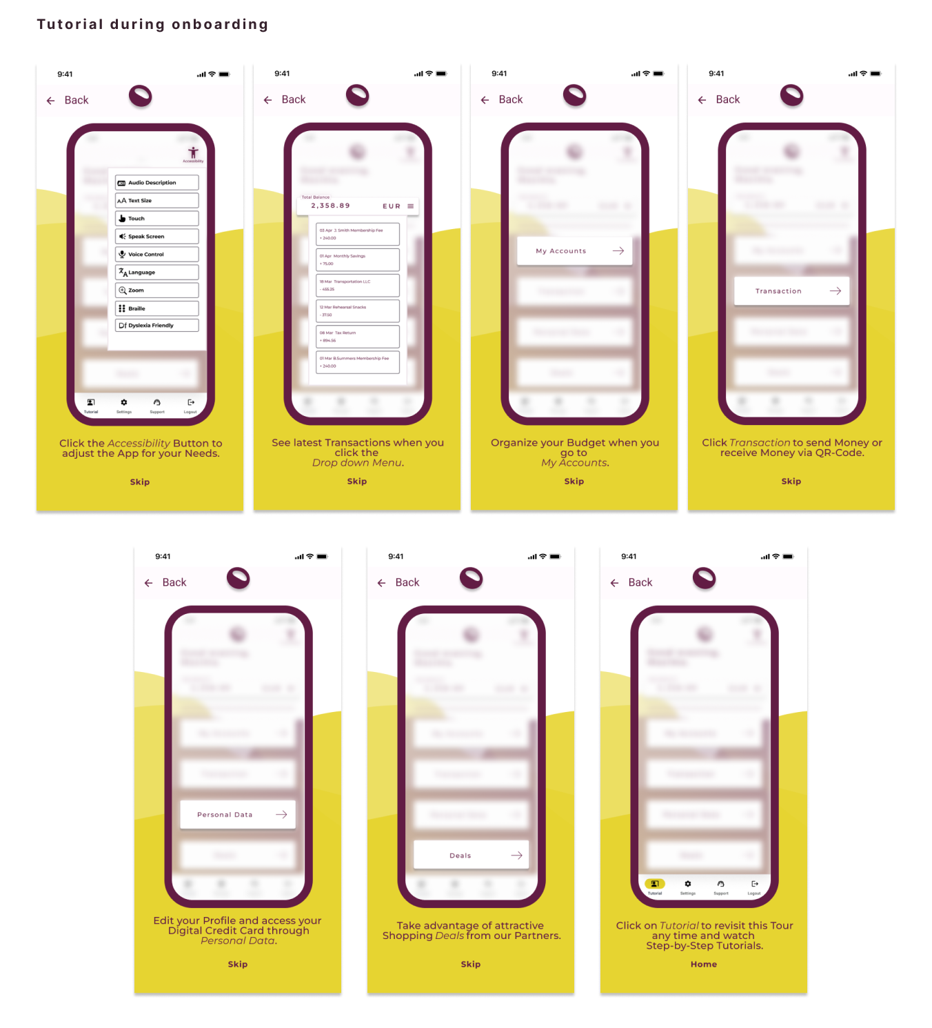
Here are some impressions:
You can click your way through thorugh the prototype below:
Takeaways
I am a Problem Solver.
Over the past six months, I was on a journey of learning how to apply this strength in the field of UX Design.
I learned new techniques and methods that enriched my previous knowledge in research. I learned new tools and stepped into a new field which has broadened my horizon.
Over the past six months, I was on a journey of learning how to apply this strength in the field of UX Design.
I learned new techniques and methods that enriched my previous knowledge in research. I learned new tools and stepped into a new field which has broadened my horizon.
The process of design and creation is messy, chaotic, and constantly changing!
A design is never done.
I have learned that a product should never be considered “done”. Technical devices change, and so do
people, our users. A product should be under regular revision to validate its utility and usability for
our user.
Trust the process.
Every step during the UX Design process has its purpose, and should be followed to develop a product that meets the business requirements, aligns all stakeholders, and after all serves users.
We´re all edge cases.
In UX Design, there shouldn´t be a broad mass. We design products for people and everyone should be considered.